Case Study

Deinjob.net

Deinjob.net is a modern recruiting platform built to simplify hiring for businesses through clear structure, transparent pricing, and strong visual hierarchy. I designed and developed the website in Webflow to highlight trust, speed, and clarity—turning a complex HR service into an easy, conversion-focused experience that builds credibility and drives employer inquiries.

Web Design & Web Development
Client
CompetentSolutions
GmbH
Date
2023
Role
Web designer & developer
Website
www.deinjob.net

Project overview

Deinjob.net is a recruiting company that helps businesses quickly connect with qualified, competitive candidates. My goal was to simplify their digital presence and make the hiring process smoother for both the company and its clients. The challenge was to create a website that feels modern, structured, and distinct from typical job platforms — something clear, trustworthy, and conversion-focused.

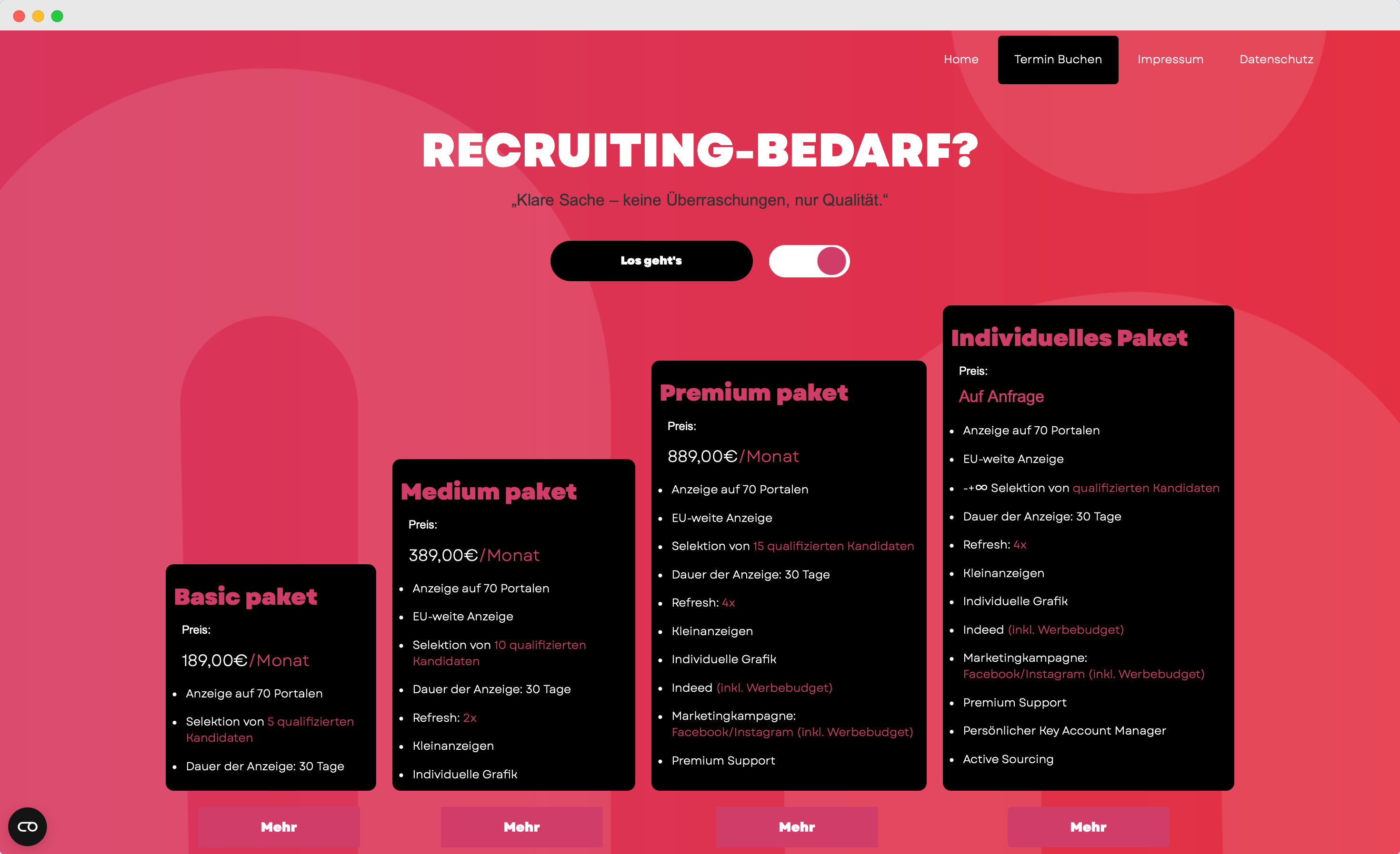
I designed and developed the new Webflow site to make it effortless for employers to compare packages and get in touch. Each plan includes a short inquiry form for quick questions and the option to schedule a video call directly through Calendly. The website is fully responsive across all devices — from small tablets to laptops — knowing that business professionals often work on the go. To ensure accessibility, the platform is also available in two languages, making it easy to understand for everyone.

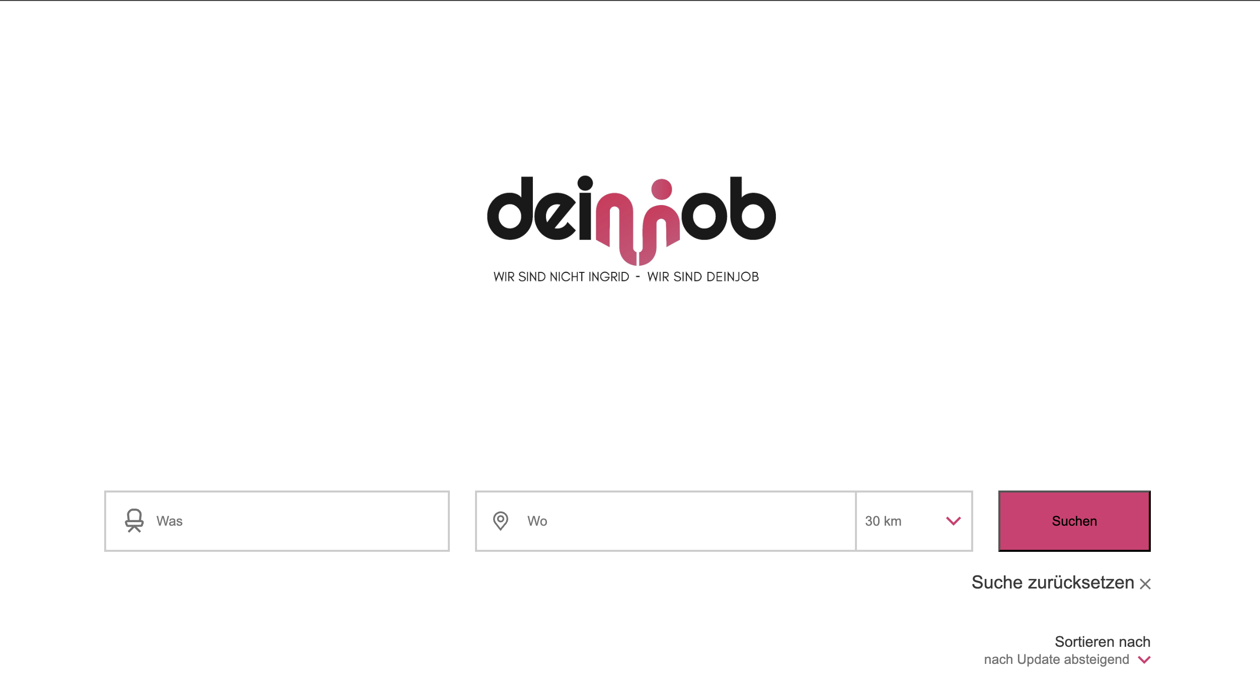
Instead of a generic job-board layout, I focused on building a conversion-oriented experience. From the first scroll, users immediately understand the value, see transparent pricing, and are guided to either book a meeting or start with a package. To make the platform more useful for job seekers as well, I integrated the Compana database — allowing users to filter openings by location, job role, and search radius. This connection ensures that all job listings are accurate, relevant, and easy to explore for potential candidates.

To accomplish all of this, I first took time to meet with the client and understand their goals, challenges, and expectations for the project. We discussed how the new website could not only improve their online presence but also remove the daily frustrations they faced with outdated systems. Through regular online meetings and open communication, we maintained a clear workflow — ensuring that every question or idea was addressed quickly and effectively throughout the process.

The build phase

The client wanted a simple, focused website with only two clear goals — allowing visitors to either explore available jobs or post a new job advertisement. I structured the site around this minimal, two-path experience. From the hero section, users immediately see two main buttons — “Jobs” and “Post Job Advertisement” — along with the logo and social media links. This clean, distraction-free layout pushes visitors to act right away, whether by submitting an inquiry or scheduling a meeting.

Visually, the design follows a minimalistic style with subtle tech-modern details, using calm colors, balanced spacing, and precise typography. The highlight of the design is the interactive pricing cards, built to let employers easily compare job posting packages. Each card reveals additional details on hover through smooth animations, while an inquiry form sits just below every plan for fast communication.

On the technical side, I integrated the Compana job database, enabling users to filter listings by location, job role, and search radius. I also embedded Calendly for direct video call scheduling, and set up PHP-powered forms with automated email responses to ensure messages reached the right department instantly. Some features, such as the hover animations and form behavior, were refined using custom JavaScript for smoother performance and better control within Webflow.

To guarantee perfect responsiveness, I manually adjusted grid layouts and typography scaling across all breakpoints. After a full week of testing on multiple devices — including iPhones, iPads, laptops, and larger screens — I invited the Deinjob team to review everything one last time before launch.

The most challenging part was fitting all the information into the card section without breaking the design balance. After several iterations and testing different visual approaches (both online and offline inspiration), I achieved a clean, efficient layout that communicates clearly without feeling crowded.

Final outcome

The result was a clean, modern, and purpose-driven website that delivers exactly what Deinjob needed — clarity, functionality, and speed. The new platform allows employers to quickly compare job posting options, reach out instantly, or book a meeting without confusion. Job seekers benefit from a dynamic search system powered by the Compana integration, helping them find relevant openings faster.

From both the client’s and users’ perspectives, the website feels simple yet professional — something reliable that reflects the quality of Deinjob’s service. It’s responsive across all devices, loads quickly, and supports easy content management through Webflow.

For me, this project perfectly represents how design and strategy can work together: transforming a complex HR service into a smooth digital experience that converts visitors into real leads. It also highlights my ability to blend design thinking with technical precision — from custom animations and integrations to user-focused structure and testing.

Let's get to WORK

Submit your E-mail on which I will follow up with termin and call link
Thank you! Your submission has been received!
Oops! Something went wrong while submitting the form.